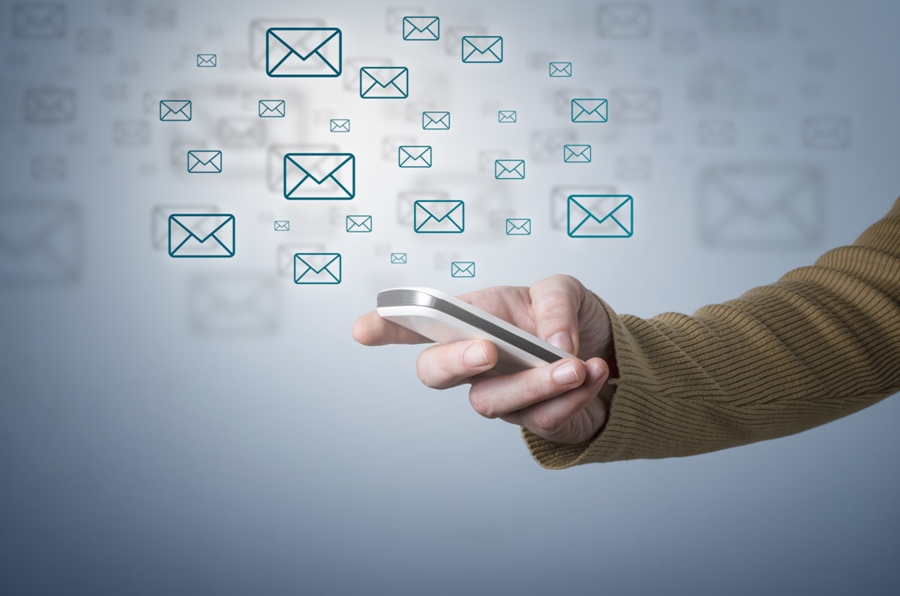
Having a clear and concise message should be a staple of any email. Nowadays, we use email service so much in our professional and personal lives. Smartphone usage increasing day by day, marketers have discovered a new way for their promotion. Mobile marketing is an effective way to convey the message. 44% of users use other gadgets, other than computers, to access their email, and the percentage is expected to grow in the coming years. You should keep in mind the following tips to make your email marketing campaign more mobile friendly.

Short and Subject Content
First of all, and most importantly, is to keep the content of your email brief and on the subject. People today, check their email on the go and cannot be caught in different situations. If the content of the email is too long, that it will not be read in full. Secondly, the subject of the email must be attractive to capture the reader’s attention.
Avoid Multiple Column Templates
The design of the email should be simple and be based on a single-column template instead of the multiple columns. This will make the email easier to read. The advantage of a template on a single column is that it makes browsing faster and keeps the reader captivated.
Create a Visible Call-to-action
As I said above, the first rule and the most important thing is to keep a concise content. Therefore, you cannot upload a single email with too much of information. You will need to use links and buttons to send to the reader.
You will need to design a visible call-to-action. What do you want from your reader to do? If you want to click on a specific link, tell her/him. If your email is a special offer that involves buying a product, then inform it about it. Be sure there’s just a call-to-action, not two. Avoid placing a bunch of links or buttons at the end of the email. Restrict the number to one or two to make sure that the CTA is in an obvious and easily accessible place.
Use a Large Font
The experience of reading an email on your desktop is totally different from computer to the mobile. It keeps a font size that is optimal for both platforms. Preferably, the font size for the email content should be 11 and the title font should be 22. The font color should also have a darker shade with a lighter background.
Insert Images
Better to insert images in your mail instead of adding it as an attachment. Opening a mobile attachment that it will take some time, depending on the speed of the internet. However, check the layout of your design before sending it to your readers. The company logo can also be used in email to reinforce the brand name. Its location must be in a visible place, but it does not ruin the simplicity of the email.


